
1. Introduction
In this codelab, you will learn about theming your apps in Jetpack Compose using Material Design 3. You'll also learn about the key building blocks of Material Design 3 Color schemes, typography, and shapes, which help you theme your application in personalized and accessible ways.
In addition, you'll explore support of dynamic theming along with different emphasis levels.
What you will learn
In this codelab, you will learn:
- Key aspects of Material 3 theming
- Material 3 color schemes and how to generate themes for your app
- How to support dynamic and light/dark theming for your app
- Typography and shapes to personalize your app
- Material 3 components and customizing to style your app
What you will build
In this codelab, you will theme an email client app called Reply. You begin with an unstyled application, using the baseline theme, and will apply what you learn to theme the application and support dark themes.

Default starting point of our app with the baseline theme.
You'll create your theme with color scheme, typography, and shapes, and then apply it to your app's email list and detail page. You will also add dynamic theme support to the app. By the end of codelab, you'll have support for both color and dynamic themes for your app.

End point of the theming codelab with light color theming and light dynamic theming.

End point of the theming codelab with dark color theming and dark dynamic theming.
What you will need
- The latest version of Android Studio
- Basic experience with the Kotlin language
- Basic understanding of Jetpack Compose
- Basic familiarity with Compose layouts, such as Row, Column, and Modifier
2. Getting set up
In this step, you download the full code of the Reply app that you'll style in this codelab.
Get the code
The code for this codelab can be found in the codelab-android-compose GitHub repository. To clone it, run:
$ git clone https://github.com/android/codelab-android-compose
Alternatively, you can download two zip files:
Check out the sample app
The code you just downloaded contains code for all available Compose codelabs. To complete this codelab, open the ThemingCodelab project inside Android Studio.
We recommend that you start with the code in the main branch and follow the codelab step-by-step at your own pace. At any time, you can run either version in Android Studio by changing the git branch of the project.
Exploring the start code
The main code contains a UI package, which has the following main packages and files that you'll interact with:
MainActivity.kt– Entry point activity where you start the Reply app.com.example.reply.ui.theme– This package contains themes, typography, and color schemes. You will be adding Material theming in this package.com.example.reply.ui.components– Contains the app's custom components like List Items, App Bars, etc. You will apply themes to these components.ReplyApp.kt– This is our main Composable function where the UI tree will be starting. You will apply top level theming in this file.
This codelab will focus on ui package files.
3. Material 3 Theming
Jetpack Compose offers an implementation of Material Design—a comprehensive design system for creating digital interfaces. The Material Design components (Buttons, Cards, Switches, etc) are built on top of Material Theming, which is a systematic way to customize Material Design to better reflect your product's brand.
Material 3 theme comprises the following subsystems to add theming to your app: color scheme, typography, and shapes. When you customize these values, your changes are automatically reflected in the M3 components you use to build your app. Let's dive into each subsystem and implement it in the sample app.

Material 3 subsystem of colors, typography, and shapes.
4. Color schemes
The foundation of a color scheme is the set of five key colors that each relate to a tonal palette of 13 tones which are used by Material 3 components.

Five baseline key colors for creating an M3 theming.
Each accent color (primary, secondary, and tertiary) is then provided in four compatible colors of different tones for pairing, defining emphasis, and visual expression.
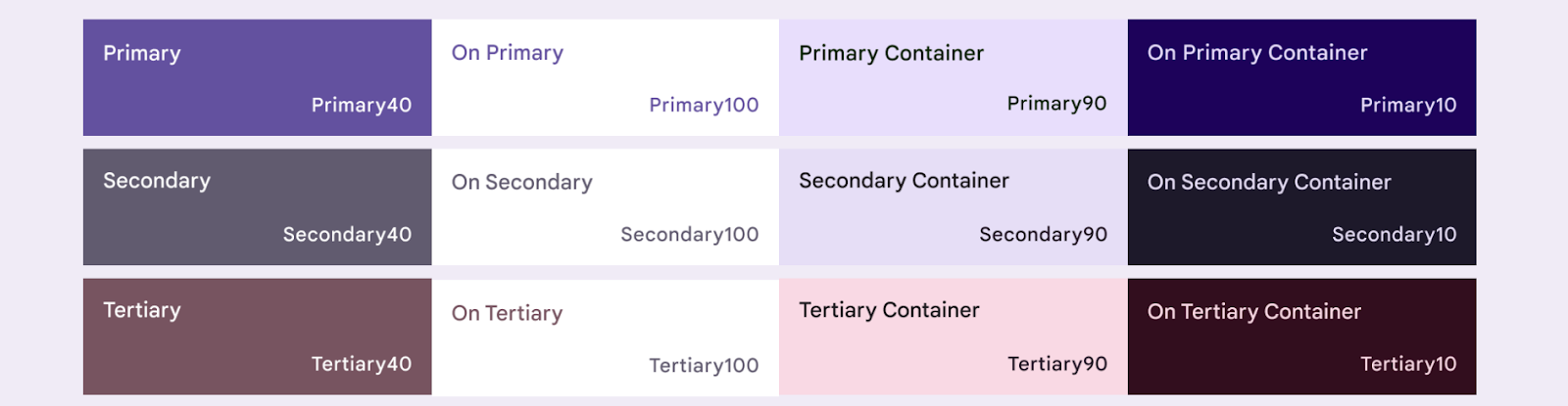
Four tonal colors of primary, secondary, and tertiary baseline accent colors.
Similarly, neutral colors are also divided into four compatible tones used for surfaces and background. These are also important to emphasize text icons when placed on any surface.
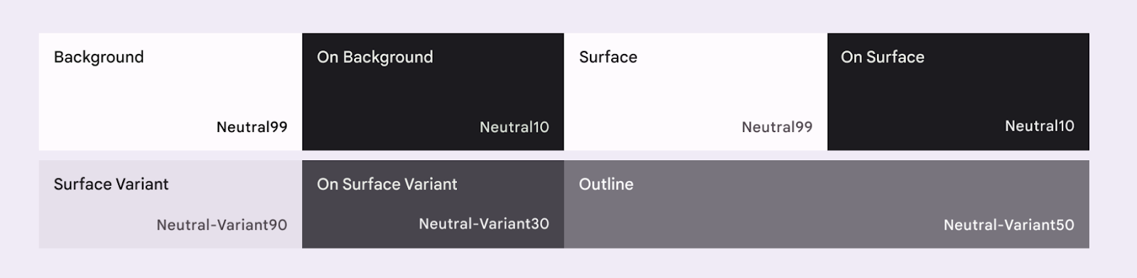
Four tonal colors of baseline neutral colors.
Read more about the Color scheme and color roles.
Generating color schemes
While you can create a custom ColorScheme manually, it's often easier to generate one using source colors from your brand. The Material Theme Builder tool allows you to do this, and optionally export Compose theming code.
You can choose any color you like, but for our use case you will use the default Reply primary color #825500. Click on Primary color in the left Core colors section and add the code in the color picker.
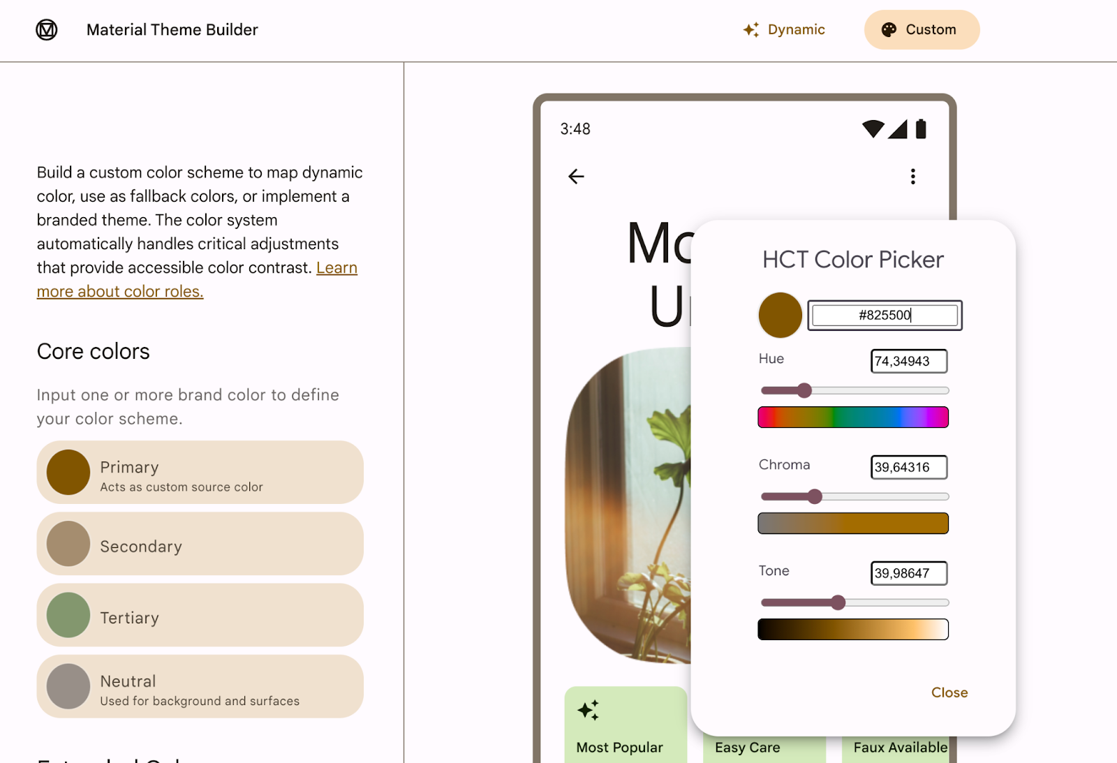
Adding primary color code in Material Theme Builder.
Once you add the primary color in the Material Theme Builder, you should see the following theme and the option to export in the top right corner. For this codelab, you export the theme in Jetpack Compose.

Material Theme Builder with the option to export at the top right corner.
The primary color #825500 generates the following theme that you'll add to the app. Material 3 provides a wide range of color roles to flexibly express a component's state, prominence, and emphasis.

Exported light and dark color scheme from primary color.
The Color.kt generated file contains the colors of your theme with all the roles defined for both light and dark theme colors.
Color.kt
package com.example.reply.ui.theme
import androidx.compose.ui.graphics.Color

val md_theme_light_primary = Color(0xFF825500)
val md_theme_light_onPrimary = Color(0xFFFFFFFF)
val md_theme_light_primaryContainer = Color(0xFFFFDDB3)
val md_theme_light_onPrimaryContainer = Color(0xFF291800)
val md_theme_light_secondary = Color(0xFF6F5B40)
val md_theme_light_onSecondary = Color(0xFFFFFFFF)
val md_theme_light_secondaryContainer = Color(0xFFFBDEBC)
val md_theme_light_onSecondaryContainer = Color(0xFF271904)
val md_theme_light_tertiary = Color(0xFF51643F)
val md_theme_light_onTertiary = Color(0xFFFFFFFF)
val md_theme_light_tertiaryContainer = Color(0xFFD4EABB)
val md_theme_light_onTertiaryContainer = Color(0xFF102004)
val md_theme_light_error = Color(0xFFBA1A1A)
val md_theme_light_errorContainer = Color(0xFFFFDAD6)
val md_theme_light_onError = Color(0xFFFFFFFF)
val md_theme_light_onErrorContainer = Color(0xFF410002)
val md_theme_light_background = Color(0xFFFFFBFF)
val md_theme_light_onBackground = Color(0xFF1F1B16)
val md_theme_light_surface = Color(0xFFFFFBFF)
val md_theme_light_onSurface = Color(0xFF1F1B16)
val md_theme_light_surfaceVariant = Color(0xFFF0E0CF)
val md_theme_light_onSurfaceVariant = Color(0xFF4F4539)
val md_theme_light_outline = Color(0xFF817567)
val md_theme_light_inverseOnSurface = Color(0xFFF9EFE7)
val md_theme_light_inverseSurface = Color(0xFF34302A)
val md_theme_light_inversePrimary = Color(0xFFFFB951)
val md_theme_light_shadow = Color(0xFF000000)
val md_theme_light_surfaceTint = Color(0xFF825500)
val md_theme_light_outlineVariant = Color(0xFFD3C4B4)
val md_theme_light_scrim = Color(0xFF000000)

val md_theme_dark_primary = Color(0xFFFFB951)
val md_theme_dark_onPrimary = Color(0xFF452B00)
val md_theme_dark_primaryContainer = Color(0xFF633F00)
val md_theme_dark_onPrimaryContainer = Color(0xFFFFDDB3)
val md_theme_dark_secondary = Color(0xFFDDC2A1)
val md_theme_dark_onSecondary = Color(0xFF3E2D16)
val md_theme_dark_secondaryContainer = Color(0xFF56442A)
val md_theme_dark_onSecondaryContainer = Color(0xFFFBDEBC)
val md_theme_dark_tertiary = Color(0xFFB8CEA1)
val md_theme_dark_onTertiary = Color(0xFF243515)
val md_theme_dark_tertiaryContainer = Color(0xFF3A4C2A)
val md_theme_dark_onTertiaryContainer = Color(0xFFD4EABB)
val md_theme_dark_error = Color(0xFFFFB4AB)
val md_theme_dark_errorContainer = Color(0xFF93000A)
val md_theme_dark_onError = Color(0xFF690005)
val md_theme_dark_onErrorContainer = Color(0xFFFFDAD6)
val md_theme_dark_background = Color(0xFF1F1B16)
val md_theme_dark_onBackground = Color(0xFFEAE1D9)
val md_theme_dark_surface =