Documentation for automated readers A curated documentation index is available at: https://grafana.com/llms.txt
A complete documentation index is available at: https://grafana.com/llms-full.txt These indexes can help with page discovery before fetching individual documents.
This page is also available in Markdown, which may be easier for automated readers
and AI tools to parse than HTML. The Markdown version is available at
https://grafana.com/docs/grafana/next/visualizations/panels-visualizations/visualizations/gauge.md, or by sending
Accept: text/markdown to https://grafana.com/docs/grafana/next/visualizations/panels-visualizations/visualizations/gauge/. For broader
documentation discovery, the curated index is available at https://grafana.com/llms.txt
and the complete index is available at https://grafana.com/llms-full.txt.
Menu
This is documentation for the next version of Grafana documentation. For the latest stable release, go to the latest version.
Gauges are single-value visualizations that allow you to quickly visualize where a value falls within a defined or calculated min and max range. With repeat options, you can display multiple gauges, each corresponding to a different series, column, or row.
You can use gauges if you need to track:
Service level objectives (SLOs)
How full a piece of equipment is
How fast a vehicle is moving within a set of limits
Network latency
Equipment state with set point and alarm thresholds
CPU consumption (0-100%)
RAM availability
Configure a gauge visualization
The following video provides beginner steps for creating gauge panels. You’ll learn the data requirements and caveats, special customizations, and much more:
Give it a try using Grafana Play
With Grafana Play, you can explore and see how it works, learning from practical examples to accelerate your development.
This feature can be seen on Grafana Gauge Visualization.
To create a gauge visualization you need a dataset containing at least one numeric field. These values are identified by the field name. Additional text fields aren’t required but can be used for identification and labeling.
Example - One row, multiple values
The gauge visualization can support multiple fields in a dataset.
value1
value2
value3
5
3
10
When there are multiple values in the dataset, the visualization displays multiple gauges and automatically defines the minimum and maximum. In this case, those are 3 and 10. Because the minimum and maximum values are defined, each gauge is shaded in to show that value in relation to the minimum and maximum.
Example - Multiple rows and values
The gauge visualization can display datasets with multiple rows of data or even multiple datasets.
Identifier
value1
value2
value3
A
5
3
10
B
6
9
15
C
1
4
8
By default, the visualization calculates a single value per column or series and displays only the last row of data. However, it derives the minimum and maximum from the full dataset, even if those values aren’t visible.
In this example, that means only the last row of data, row C, is displayed in the gauges and the minimum and maximum values are 1 and 15. The value 1 is displayed because it’s in the last row, while 15 is not.
If you want to show one gauge per table cell, under Value options, change the Show setting from Calculate to All values. Each gauge label is a concatenation of the text column with each value’s column name.
Example - Control min and max
You can control the minimum and maximum values by defining them directly in your dataset.
This is an alternative to setting it manually in the field options.
value
max
min
5
10
2
In this example, to hide the min and max fields, select the “value” field in Value options > Fields.
Even when minimum and maximum values aren’t displayed, the visualization still pulls the range from them.
Configuration options
The following section describes the configuration options available in the panel editor pane for this visualization. These options are, as much as possible, ordered as they appear in Grafana.
Panel options
In the Panel options section of the panel editor pane, set options like the panel title, description, and show/hide rules.
To learn more, refer to
Configure panel options.
Add a description to a panel to share with users any important information about it, such as its purpose. Text entered in this field appears in a tooltip in the upper-left corner of the panel. Conversely, toggle on the Use as subtitle switch to display the description just below the panel title instead. You can use
variables you have defined or dashboard-scoped
built-in variables (such as $__from, $__to, $__dashboard, $__org, and $__user). Query-scoped global variables (such as $__interval and $__interval_ms) are not available in this field.
Transparent background
Toggle this switch on and off to control whether or not the panel has the same background color as the dashboard.
Panel links
Add
links to the panel to create shortcuts to other dashboards, panels, and external websites. Access panel links by clicking the icon next to the panel title.
Repeat options
Set whether to repeat the panel for each value in the selected variable.
Show/hide rules
Set whether to show or hide panels based on various rules.
Value options
Use the following options to refine how your visualization displays the value:
Option
Description
Show
Set how Grafana displays your data. Choose from:
Calculate - Show a calculated value based on all rows.
All values - Show a separate value for every row. If you select this option, then you can also limit the number of rows to display.
Calculation
If you chose Calculate as your Show option, select a reducer function that Grafana will use to reduce many fields to a single value. For a list of available calculations, refer to
Calculation types.
Limit
If you chose All values as your Show option, enter the maximum number of rows to display. The default is 25 and the maximum is 5,000.
Fields
Select the fields display in the panel.
Gauge options
Adjust how the gauge is displayed.
Option
Description
Style
Choose a gauge shape:
Circle - Fills clockwise around a circle, starting from the 12 o’clock position.
Arc - Fills from left to right around an arc.
Orientation
Choose a stacking direction:
Auto - Gauges display in rows and columns.
Horizontal - Gauges display top to bottom.
Vertical - Gauges display left to right.
Gauge size
Choose a gauge size mode:
Auto - Grafana determines the best gauge size.
Manual - Manually configure the gauge size.
This option only applies when Orientation is set to Horizontal or Vertical.
Min width
Set the minimum width of vertically oriented gauges. If you set a minimum width, the x-axis scroll bar is automatically displayed when there’s a large amount of data. This option only applies when Gauge orientation is Vertical and Gauge size is set to Manual.
Min height
Set the minimum height of horizontally oriented gauges. If you set a minimum height, the y-axis scroll bar is automatically displayed when there’s a large amount of data. This option only applies when Gauge orientation is Horizontal and Gauge size is set to Manual.
Bar width factor
Set a factor between 0.1 and 1 to control the width of the gauge bar relative to the total gauge area.
Segments
Enter a value between 1 and 100 to break the gauge into equal segments. Segments are always fully filled, even if the gauge’s current value falls within a segment.
Bar style
Choose the shape of the gauge bar. Choose from Flat or Rounded. Only applies if Segments is set to 1. Note: All segmented gauges are flat.
Segment spacing
Enter a value between 0 and 1 to set the factor that controls the size of the gap between each segment. This option is only applies when the Segments value is more than 1.
Text mode
Choose what text to render in the gauge:
Auto - Grafana determines the text to show.
Value and name - Renders both the value and series name.
Control whether a threshold band is shown outside the inner gauge value band.
Show labels
Control whether threshold and neutral labels are shown outside of the gauge.
Endpoint marker
Choose how to mark the current value endpoint. Choose from Point, Glow, or None. Glow is available only in dark mode. This option only applies when the Bar style is Rounded.
Effects
Other styling choices you can apply to your gauge include:
Gradient - Color transitions are represented with gradients for color schemes where the gauge color differs by value. This effect is on by default.
Bar glow - Adds a glowing shadow outside the gauge bar.
Center glow - The color representing the current gauge value is visible in the center of the gauge.
Neutral value
By default, the starting value of a gauge is the minimum value, not zero.
You can change the starting value from which every gauge will be filled when you don’t want it to be the minimum value.
This option is especially useful in cases where the range of data values includes negative numbers.
If you leave this empty, Grafana uses the configured minimum value.
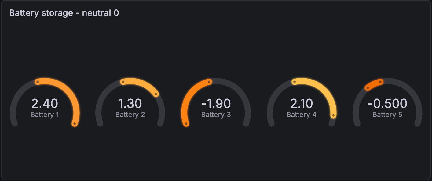
For example, you want to display the storage of several batteries and the power range is from -2.5 kW (discharging) to 2.5 kW.
When the minimum value is used as the starting point for the gauges, the visualization looks like this:
If you enter a neutral value of 0, the visualization looks like this and is easier to reason about:
Show sparkline
If you want to visualize the list of values as a time series along with the calculated gauge value, toggle on the Show sparkline switch.
Each gauge displays the sparkline inside the circle or arc:
Show thresholds
Control whether a threshold band is shown outside the inner gauge value band.
Text size options
Adjust the sizes of the gauge text.
Title - Enter a numeric value for the gauge title size.
Value - Enter a numeric value for the gauge value size.
Standard options
Standard options in the panel editor pane let you change how field data is displayed in your visualizations. When you set a standard option, the change is applied to all fields or series. For more granular control over the display of fields, refer to
Configure overrides.
Option
Description
Unit
Choose which unit a field should use.
Min/Max
Set the minimum and maximum values used in percentage threshold calculations or leave these field empty for them to be calculated automatically.
Field min/max
Enable Field min/max to have Grafana calculate the min or max of each field individually, based on the minimum or maximum value of the field.