

Typefaces
Jonathan Hoefler’s body of work includes forty-seven published families of typefaces, comprising 1,114 font styles.
-
Acropolis (1992), Archer (2001), Cesium (2020), Champion Gothic (1991), Chronicle (2002), Chronicle Text (2002), Cyclone (1999), Decimal (2019), HTF Didot (1991), Forza (2006), Giant (1996), Gotham (2000), Gotham Rounded (2004), The Historical Allsorts (1992), Hoefler Text (1991), Hoefler Titling (1994), Ideal Sans (1991), Idlewild (2004), Inkwell (2004), Isotope (2018), Knockout (1994), Knox (1993), Landmark (1999), Leviathan (1992), Mercury (1996), Mercury Text (2000), Nitro & Turbo (2001), Numbers (2006), Obsidian (2015), Operator (2016), Parliament (1995), Peristyle (2017), The Proteus Project (1991), Quarto (2007), Requiem (1991), Ringside (2016), Sagittarius (2021), Saracen (1992), Sentinel (2004), Shades (2004), Surveyor (2001), Topaz (1997), Tungsten (2003), Tungsten Rounded (2013), Verlag (1995), Vitesse (2000), Whitney (2000), and Ziggurat (1991).
-
1991: Champion Gothic, Hoefler Text, HTF Didot, Ideal Sans, Requiem, Ziggurat 1992: Acropolis, Leviathan, Saracen, The Historical Allsorts 1993: Knox 1994: Hoefler Titling, Knockout 1995: Parliament, Verlag 1996: Giant, Mercury 1997: Topaz 1999: Cyclone, Landmark 2000: Gotham, Mercury Text, Vitesse, Whitney 2001: Archer, Nitro & Turbo, Surveyor 2002: Chronicle, Chronicle Text 2003: Tungsten 2004: Gotham Rounded, Idlewild, Inkwell, Sentinel 2006: Forza, Numbers 2007: Quarto 2013: Tungsten Rounded 2015: Obsidian 2016: Operator, Ringside 2017: Peristyle 2018: Isotope 2019: Decimal 2020: Cesium 2021: Sagittarius
A list of contributors to these projects appears below, shown in order of appearance.

Acropolis
Designed by
Jonathan Hoefler
With contributions from
Eric Siry
Special thanks to Gail Anderson
The Acropolis typeface was designed by Jonathan Hoefler in 1992. Acropolis is a design in the ‘grecian’ style, a genus of slab serif characterized by chamfered corners, which emerged in the late Georgian period and flourished in the United States of the mid-nineteenth century. A part of The Proteus Project, the typographic theme-and-variations based on related Regency styles, Acropolis was the first grecian type family to include a companion cursive italic. Acropolis was created for Rolling Stone, in whose pages the typeface first appeared in 1993.
Acropolis is available from the Hoefler&Co website, typography.com.

Archer
Designed by
Jonathan Hoefler
With contributions from
Tobias Frere-Jones, Jesse Ragan
Additional material by
Jordan Bell, Andy Clymer
Special thanks to Gael Towey and Barbara de Wilde
The Archer typeface was designed by Jonathan Hoefler in 2001. While rooted in the ‘geometric slab serif’ style that emerged in the early nineteenth century (and reached full flower a century later), Archer’s many liberties with the style include its uncharacteristic application of ‘ball terminals’ to capital letters such as ‘C’ and ‘S,’ a detail traditionally found only in the lowercase alphabet. Archer was created for Martha Stewart Living, in whose pages the typeface first appeared in 2001.
Advance copies of Archer were circulated under the working title msl Archer.
Archer is available from the Hoefler&Co website, typography.com.

Cesium
Designed by
Jonathan Hoefler
Based on
Vitesse by Hoefler&Co.
With contributions from
Sara Soskolne, Colin M. Ford, Troy Leinster
The Cesium typeface was designed by Jonathan Hoefler in 2020. An energetic inline adaptation of Hoefler’s broad-shouldered Vitesse Black typeface (2000), Cesium is named for the fifty-fifth member of the periodic table of the elements, a volatile liquid metal that presents as a scintillating quicksilver.
Cesium is available from the Hoefler&Co website, typography.com.

Champion Gothic
Designed by
Jonathan Hoefler
Special thanks to Steve Hoffman and Peter Herbert
The Champion Gothic typeface was designed by Jonathan Hoefler in 1991. A collection of six sans serifs related by width instead of weight, Champion was inspired by the sundry American wood types that were once used indiscriminately by nineteenth century poster printers, creating the riotous aesthetic that is identified with Americana. Champion Gothic was created for Sports Illustrated, in whose pages the typeface first appeared in 1991.
Advance copies of Champion Gothic were circulated under the working title S. I. Gothic.
Champion Gothic is available from the Hoefler&Co website, typography.com.

Chronicle
Designed by
Jonathan Hoefler
Based on
Chronicle Text by Hoefler&Co.
With contributions from
Tobias Frere-Jones, Jesse Ragan; Sara Soskolne
Additional material by
Colin M. Ford
Special thanks to Lucie Lacava
The Chronicle Display typeface was designed by Jonathan Hoefler in 2002, as a display-size counterpart to Chronicle Text. Chronicle is an update to the ‘scotch’ genre of typefaces, which emerged at the end of the eighteenth century, and remains one of typography’s most enduring and serviceable styles of letter. Chronicle Text was created for The Toronto Star, in whose pages the typeface first appeared in 2002.
Advance copies of Chronicle were circulated under the working title Torstar.
Chronicle is available from the Hoefler&Co website, typography.com.

Chronicle Text
Designed by
Jonathan Hoefler
With contributions from
Tobias Frere-Jones, Jesse Ragan; Sara Soskolne
Special thanks to Lucie Lacava
The Chronicle Text typeface was designed by Jonathan Hoefler in 2002, as a text-size counterpart to Chronicle Display. Chronicle is an update to the ‘scotch’ genre of typefaces, which emerged at the end of the eighteenth century, and remains one of typography’s most enduring and serviceable styles of letter. Chronicle Text was created for The Toronto Star, in whose pages the typeface first appeared in 2002.
Advance copies of Chronicle Text were circulated under the working title Torstar Text.
Chronicle Text is available from the Hoefler&Co website, typography.com.

Cyclone
Designed by
Jonathan Hoefler
Based on
Knockout by Hoefler&Co.
With contributions from
Joshua Darden
The Cyclone typeface was designed by Jonathan Hoefler in 1999. A decorative inline face, adapted from Hoefler’s Knockout No. 67 (1994), Cyclone is a ‘biform’ alphabet featuring lowercase letters drawn to the height of the capitals. A ‘chromatic’ typeface, Cyclone includes the two styles Background and Inline, designed to be set in different colors and superimposed in register.
Cyclone is available from the Hoefler&Co website, typography.com.

Decimal
Designed by
Jonathan Hoefler and Sara Soskolne
With contributions from
Jordan Bell, Colin M. Ford, Troy Leinster
The Decimal typeface was designed by Jonathan Hoefler and Sara Soskolne in 2019. Inspired by the markings on wristwatches, whose open gestures and dilated corners help create clear shapes at small sizes, Decimal was designed to preserve a vanishing and recognizable quality of horology driven nearly to extinction by digital fonts. Decimal first appeared in 2019, in an episode of the Netflix documentary ‘Abstract: The Art of Design’ devoted to Hoefler and his work, and in 2020 became the signature typeface of both the Biden–Harris campaign and the Biden White House.
Decimal is available from the Hoefler&Co website, typography.com.
htf Didot
Designed by
Jonathan Hoefler
Special thanks to Fabien Baron and Liz Tilberis
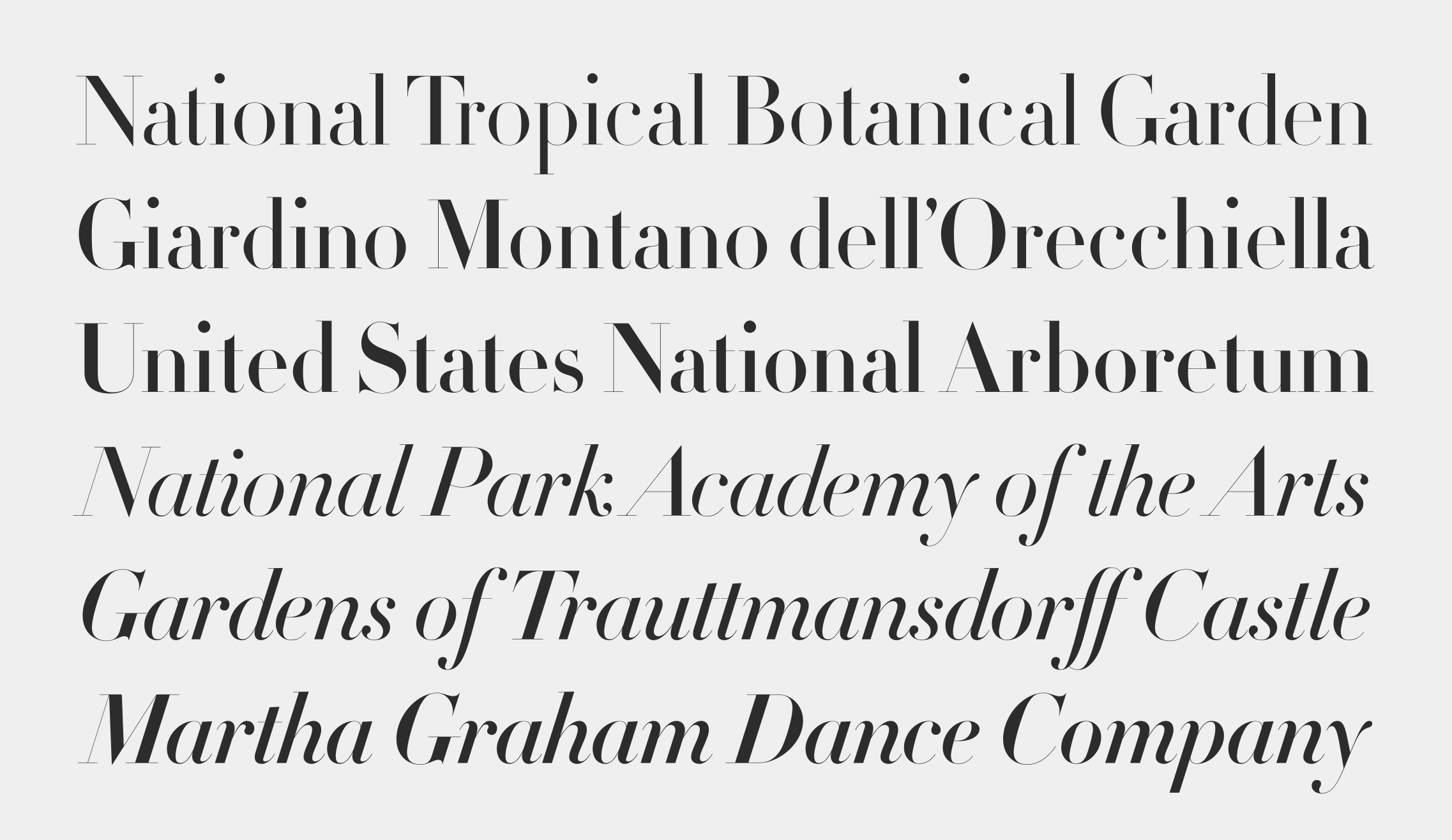
The htf Didot typeface was designed by Jonathan Hoefler in 1991. A design in the ‘modern’ genus, whose rationality and precision suggests engineering rather than penmanship, htf Didot pays homage to the French neoclassical typefounder Firmin Didot (1764–1836) whose work epitomizes the style. Designed for Harper’s Bazaar, in whose pages the typeface first appeared in September 1992, htf Didot was one of the first digital typefaces designed with a schedule of ‘optical sizes’ that preserve the fonts’ delicate hairlines at any size. htf Didot is in the permanent collection of the Museum of Modern Art in New York.
Advance copies of htf Didot were circulated under the working titles Bazaar Didot, Baron Didot, Jacquard, and Parisienne.
htf Didot is available from the Hoefler&Co website, typography.com.
