
Microsites + Interactive
WHAT WE DO
We design and build interactive platforms, data tools, and digital experiences that turn complex information into something people can use.
RELATED WORK
Accenture: Making the journey to intelligent operations visible
ExcelinEd: Turning policy data into real-world impact
ExcelinEd: How 40 school choice policies across 50 states became one navigable tool
Federal Reserve Bank of St. Louis: Making complex economic systems understandable
Future of Privacy Forum: Mapping the privacy implications of a connected world
Greater St. Louis, Inc.: A data platform for measuring regional growth
Insightful Education Solutions: The data wasn’t the problem. The language was.
REACH at Rush: My child wants a career in healthcare. Where do we start?
POLICY ADVOCACY
From raw data to ready resource
CLIENT
Insightful Education Solutions
INDUSTRY
Education policy
PROJECT
Interactive state comparison tool
Information architecture
Data visualization
Accessible web design
Report + infographics
DOWNLOAD
Save the case study as a PDF
Insightful Education Solutions had done the hard work — collecting and evaluating research on how well K-12 career and technical education programs align with real workforce demand. The substance was there. But policymakers, educators, and funders were navigating a landscape with no common language, no consistent structure, and no single place to look.
INSIGHT
The research existed. The problem was that every state named things differently, every report asked readers to bring their own map, and nobody agreed on a common organizing structure.
The challenge wasn’t the data. It was making it navigable.
SOLUTION
We worked shoulder-to-shoulder with the Insightful team to define the four core categories that would anchor the entire system — naming them, stress-testing them, making sure they were mutually exclusive, collectively exhaustive, and intuitive to a reader encountering them cold.
That architecture had to hold across a 35-page report, a companion website, and all 50 state profiles without ever making the user feel the weight of it. The real work was invisible. That was the point.
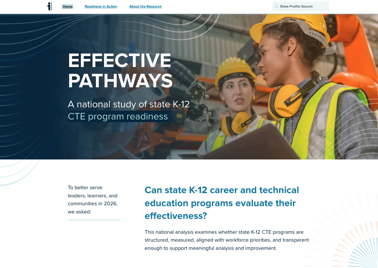
The report and companion site at effectivepathways.com give policymakers, funders, and regional leaders a single navigable resource with consistent language, clear structure, and data that finally allows apples-to-apples comparison across states.
Home page
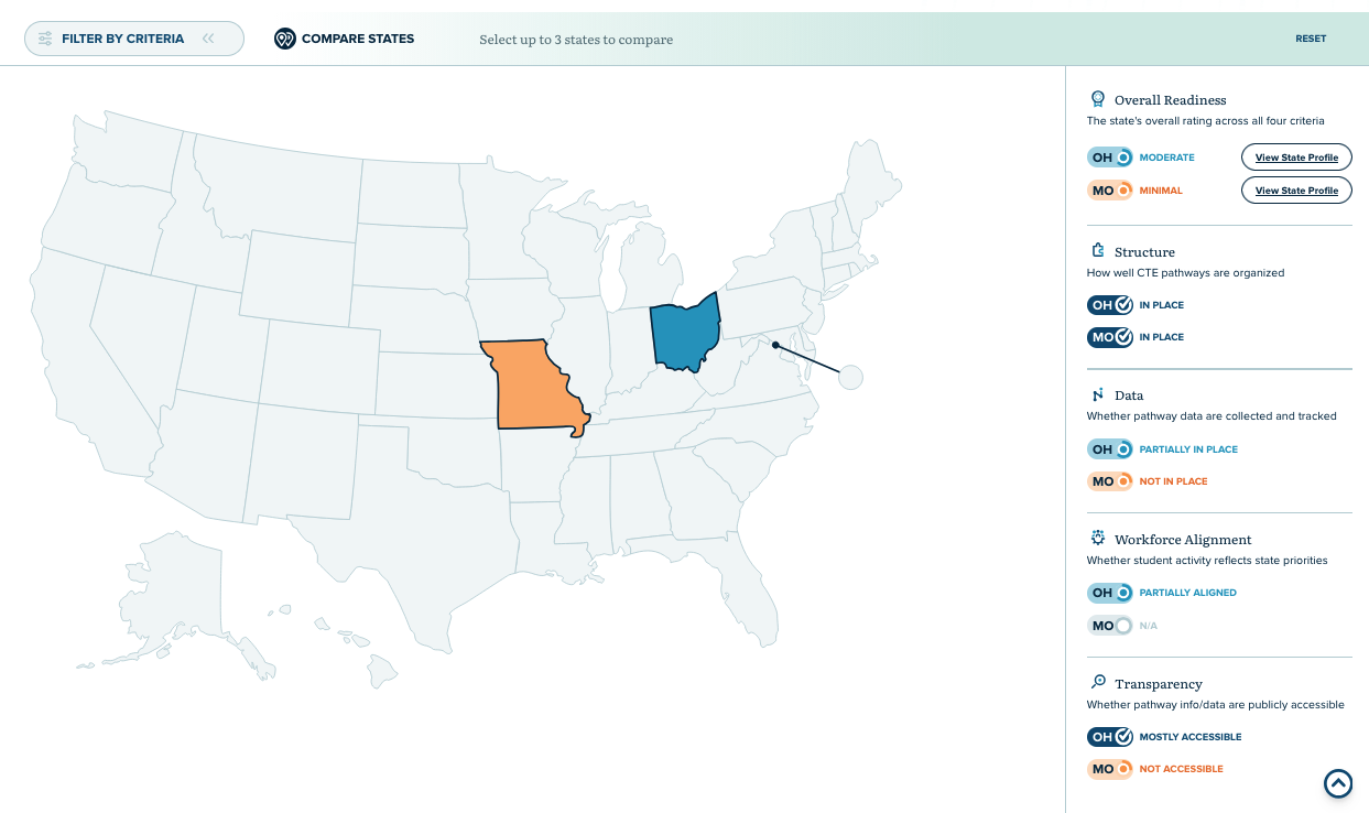
State comparison page
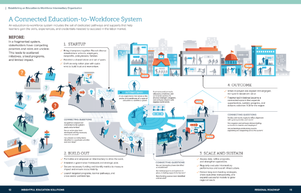
Report infographic
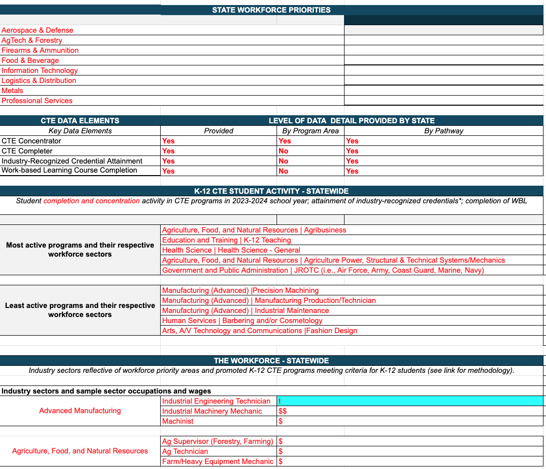
Input documents
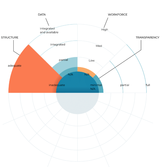
Visual explorations

Report spread
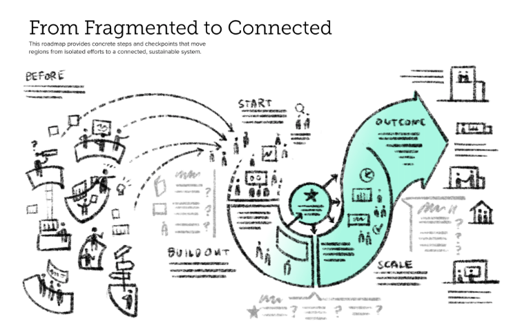
Concepts for infographic
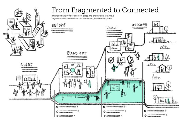
Concepts for infographic